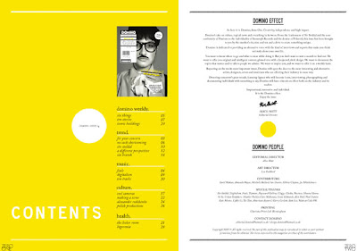
This one has a nice balance in it, which the colours in the type contribute to nicely.
I think the colours in the one gives it a nice contrast.
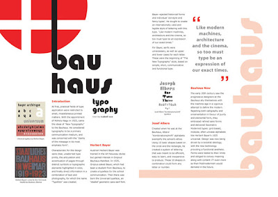
Nice idea for a layout, I like how the heading isn't straight.
Looks a little cluttered, but I still like the idea. Having the image where it is gives it a nice flow. It might be nice to try something similar, but perhaps with the opacity lowered on the image.
Web page, but still a nice layout.


No comments:
Post a Comment